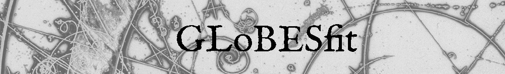
The predicted flux of antineutrinos from fissions of
235U. Shown are the ratios of the Huber-Mueller (HM; orange),
ab initio (blue) and Hayen-Kostensalo-Severijns-Suhonen (HKSS; cyan) flux models relative to the central values of the HM predictions. Error bands are shown for the HM and HKSS predictions. Also shown are measurements of the
235U spectrum from Daya Bay (red) and PROSPECT (pink).
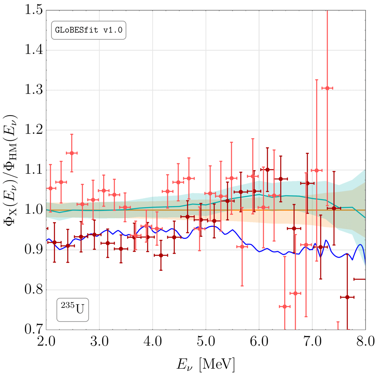
The predicted flux of antineutrinos from fissions of
238U. Shown are the ratios of the HM (orange),
ab initio (blue) and HKSS (cyan) flux models relative to the central values of the HM predictions. Error bands are shown for the HM and HKSS predictions.
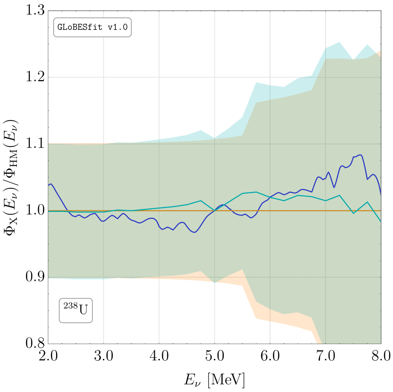
The predicted flux of antineutrinos from fissions of
239Pu. Shown are the ratios of the HM (orange),
ab initio (blue) and HKSS (cyan) flux models relative to the central values of the HM predictions. Error bands are shown for the HM and HKSS predictions. Also shown are measurements of the
239Pu spectrum from Daya Bay (red).
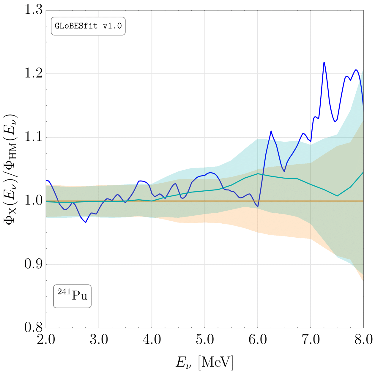
The predicted flux of antineutrinos from fissions of
241Pu. Shown are the ratios of the HM (orange),
ab initio (blue) and HKSS (cyan) flux models relative to the central values of the HM predictions. Error bands are shown for the HM and HKSS predictions.
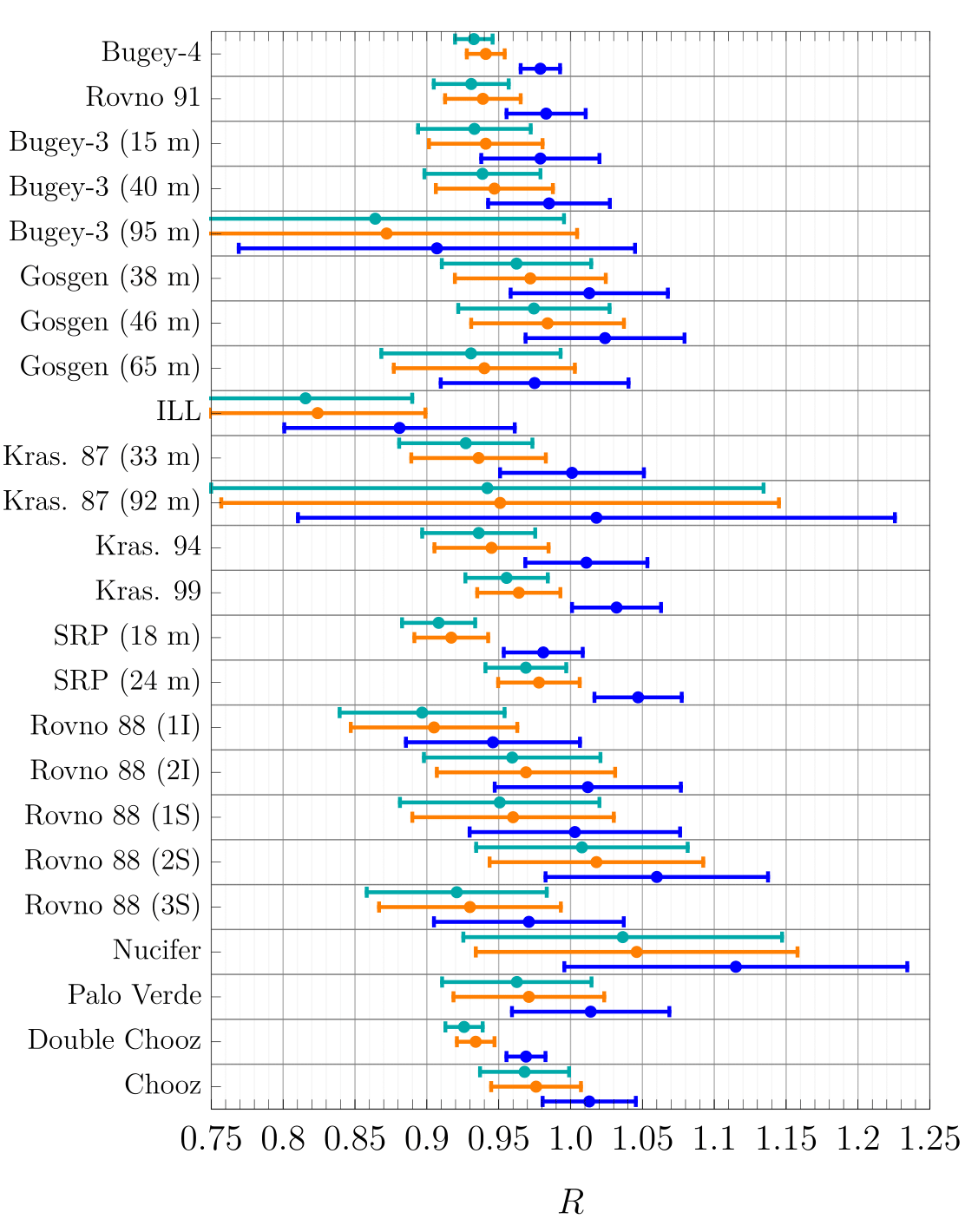
The ratios
R of the energy-integrated interaction rates measured at different experiments relative to three reactor antineutrino flux models: HM (orange),
ab initio (blue) and HKSS (cyan). This figure shows the rates at experiments that do not track the interaction rate as a function of reactor core composition; the experiments are indicated on the vertical axis. The error bands shown are experimental only.
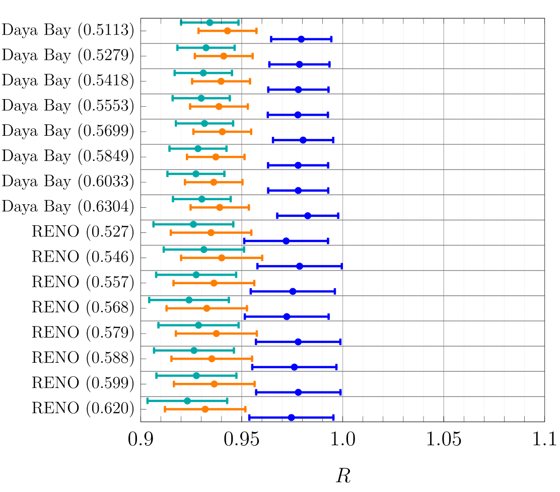
The ratios
R of the energy-integrated interaction rates measured at different experiments relative to three reactor antineutrino flux models: HM (orange),
ab initio (blue) and HKSS (cyan). This figure shows the rates at experiments that track the interaction rate as a function of reactor core composition; the experiment and the corresponding average
235U fission fraction are indicated on the vertical axis. The error bands shown are experimental only.
Spectra
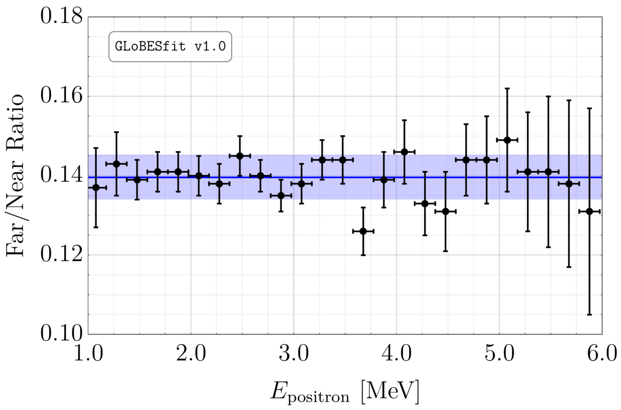
The ratio of the observed spectra of antineutrino interactions at Bugey-3 in the far (40 m) and near (15 m) detectors. The data are the black points and the prediction is the blue line. Statistical errors are shown as black error bars; systematic errors are shown as a blue band.
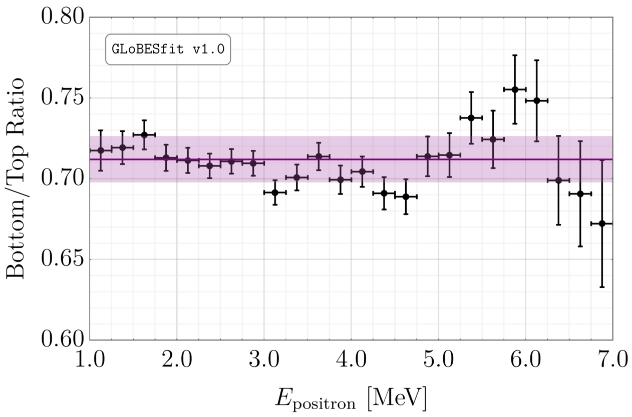
The ratio of the observed spectra of antineutrino interactions at DANSS in the lower (12.2 m) and upper (10.2 m) detectors. The data are the black points and the prediction is the purple line. Statistical errors are shown as black error bars; systematic errors are shown as a purple band.
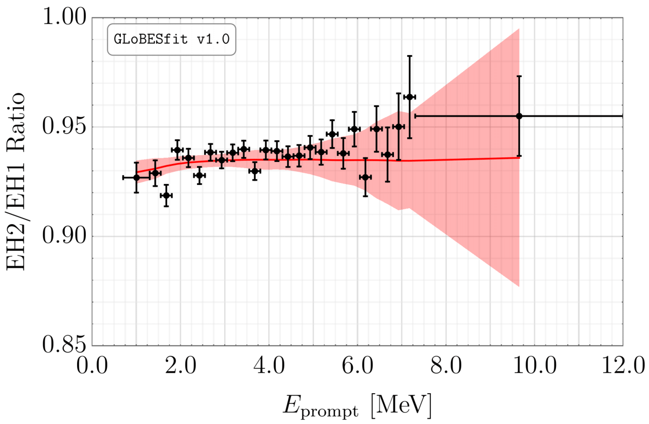
The ratio of the observed spectra of antineutrino interactions at Daya Bay in EH2 and EH1. The data are the black points and the prediction is the red line. Statistical errors are shown as black error bars; systematic errors are shown as a red band.
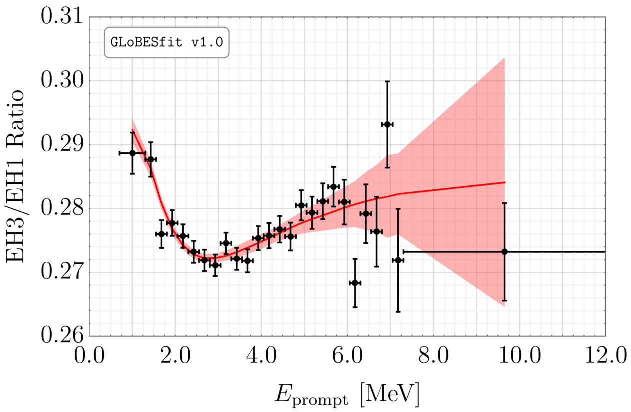
The ratio of the observed spectra of antineutrino interactions at Daya Bay in EH3 and EH1. The data are the black points and the prediction is the red line. Statistical errors are shown as black error bars; systematic errors are shown as a red band.
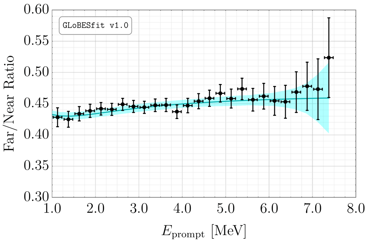
The ratio of the observed spectra of antineutrino interactions at Double Chooz in the far and near detectors. The data are the black points and the prediction is the cyan line. Statistical errors are shown as black error bars; systematic errors are shown as a cyan band.
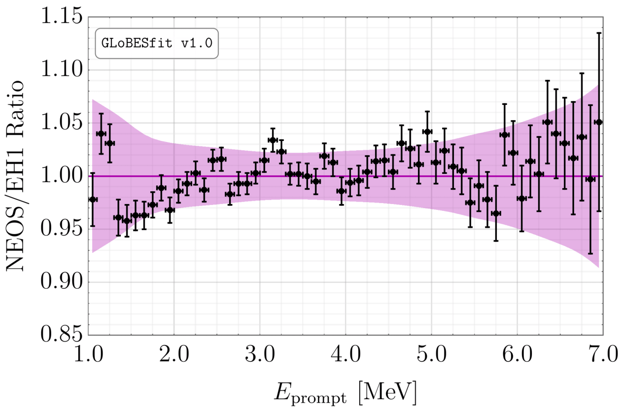
The ratio of the observed spectra of antineutrino interactions at NEOS and Daya Bay EH1. The data are the black points and the prediction is the purple line. Statistical errors are shown as black error bars; systematic errors are shown as a purple band.
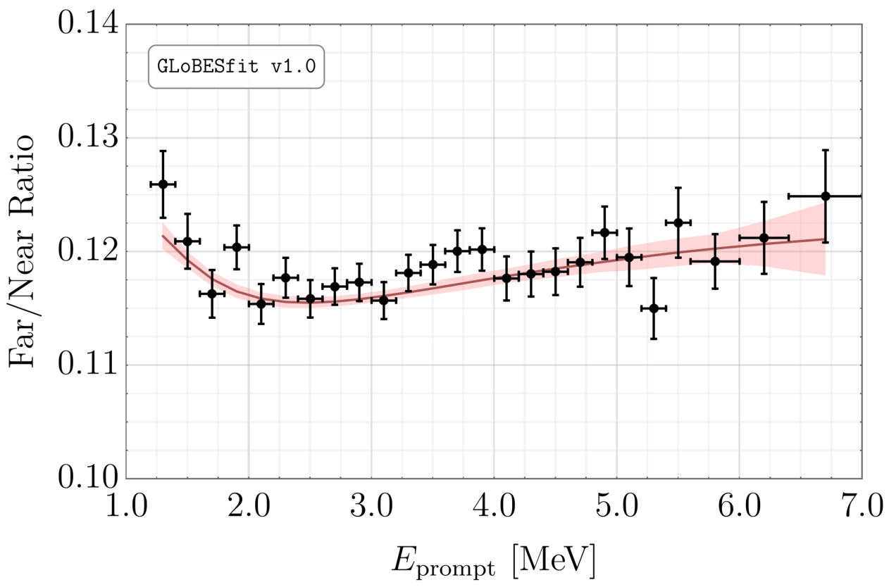
The ratio of the observed spectra of antineutrino interactions at RENO in the far and near detectors. The data are the black points and the prediction is the red line. Statistical errors are shown as black error bars; systematic errors are shown as a red band.
Results
Rates
The preferred regions of the sterile neutrino parameter space from our analysis of all rate experiments. The solid (dashed) contours represent the 95% (99%) confidence level contours. We separately show results for the comparision between data and the HM (orange),
ab initio (blue) and HKSS (cyan) flux models.
The preferred regions of the sterile neutrino parameter space from our analysis of rate experiments conducted after 2010. The solid (dashed) contours represent the 95% (99%) confidence level contours. We separately show results for the comparision between data and the HM (orange),
ab initio (blue) and HKSS (cyan) flux models.
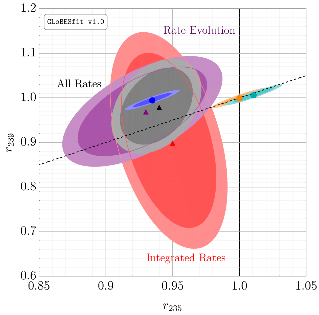
The results of an analysis in which the total
235U and
23pPu fluxes are rescaled (by factors
r235 and
r239, respectively) relative to their HM values
instead of introducing a sterile neutrino. Red regions are our results for experiments that measure the average rate over the whole experiment; purple is for experiments that track the interaction rate as the composition of the core(s) changes; and gray is for all experiments. The dark (light) shading represents the 95% (99%) confidence level. Shown also are the values preferred by the HM (orange),
ab initio (blue) and HKSS (cyan) flux models, as well as their 1- (dark) and 2-σ (light) regions.
Spectra
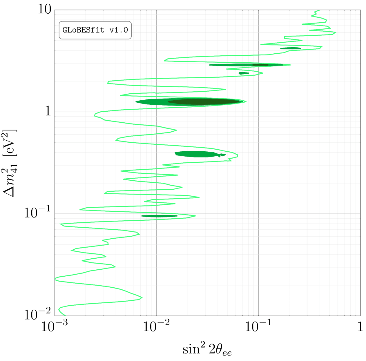
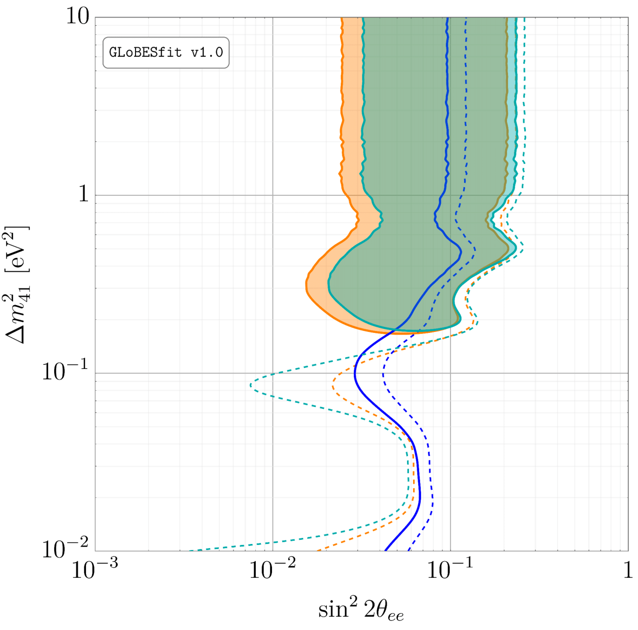
The preferred regions of the sterile neutrino parameter space from our analysis of all spectrum experiments. The dark green, green and light green contours represent the 95%, 99% and 99.9% confidence level contours, respectively.
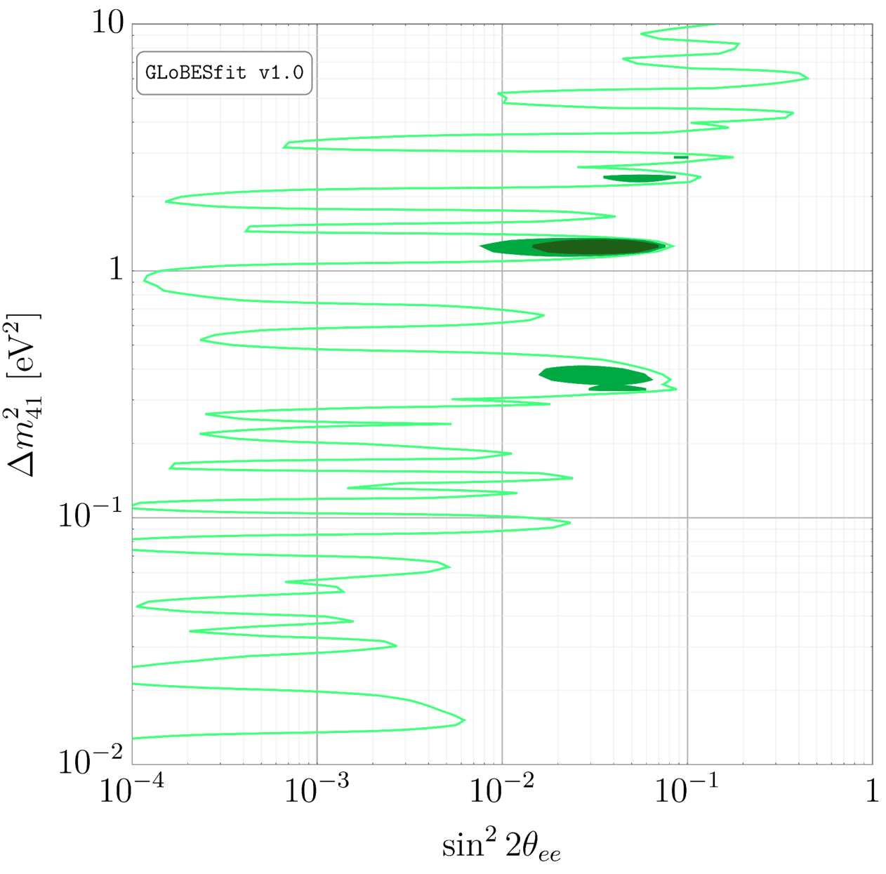
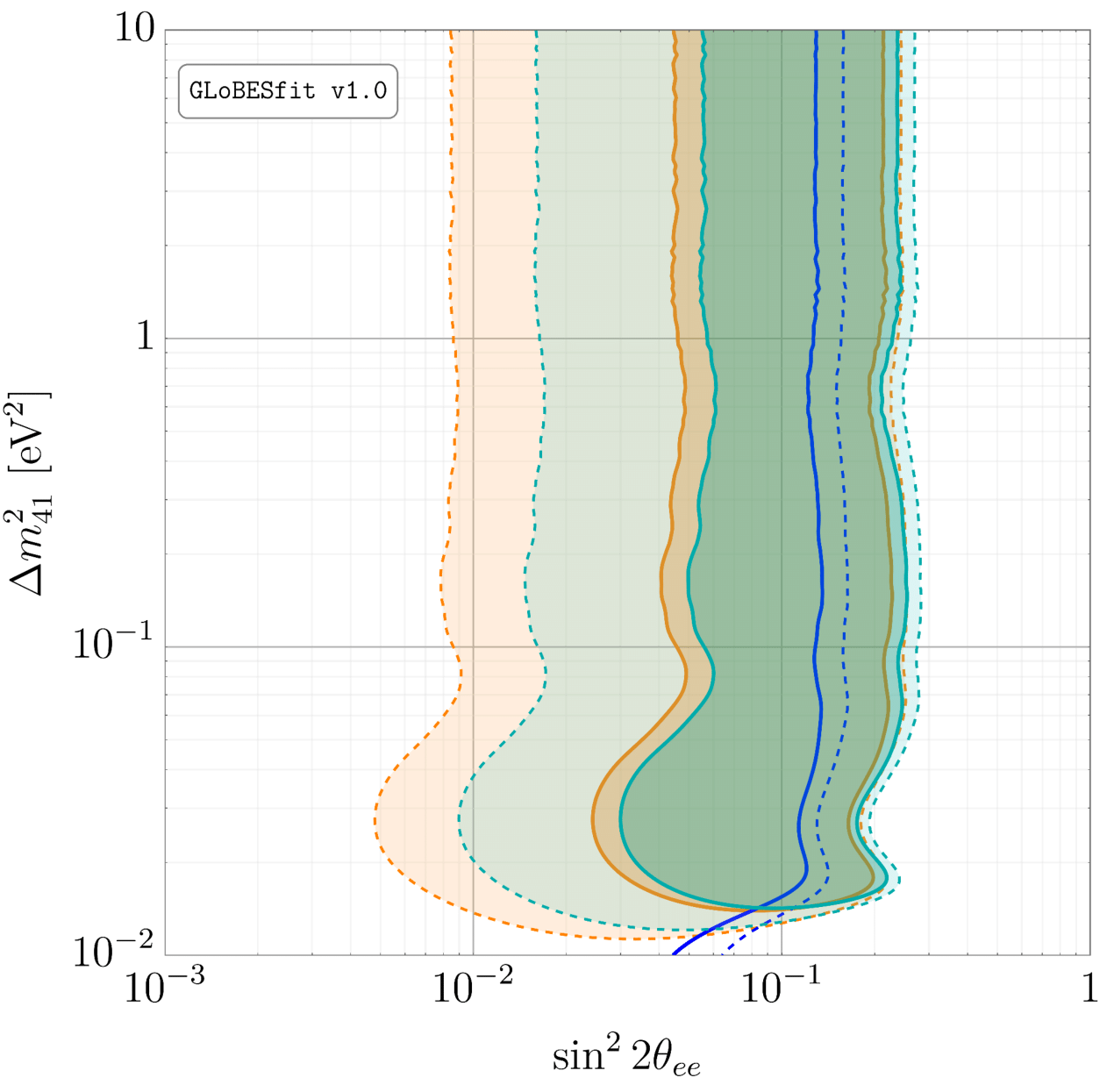
The preferred regions of the sterile neutrino parameter space from our analysis of spectrum experiments conducted after 2010. The dark green, green and light green contours represent the 95%, 99% and 99.9% confidence level contours, respectively.
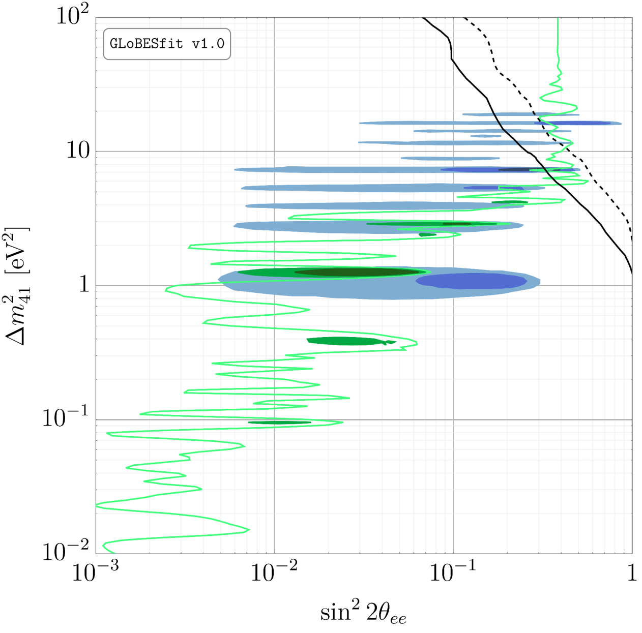
A comparison between our results and recent findings from Neutrino-4. The green contours are our results for all spectrum experiments (see the figure above). The dark blue, blue and light blue contours are the 1-, 2- and 3-σ contours, respectively, from
a recent update to Neutrino-4 data. The solid (dashed) black curve is the 90% (99%) confidence limit from
a recent analysis of tritium-endpoint experiments.
5 MeV Bump
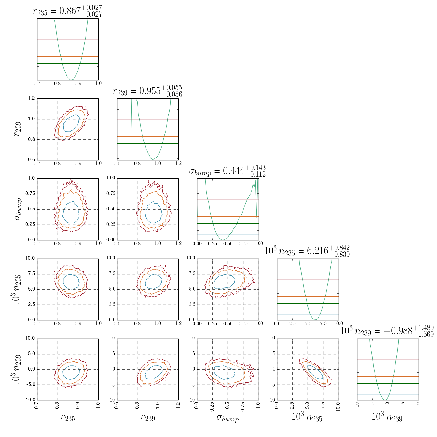
The results from a Markov Chain Monte Carlo analysis of spectral data to determine the preference for a Gaussian feature at 5 MeV in the reactor antineutrino spectrum. This analysis uses data from Daya Bay and RENO. The overall goodness of fit is given by χ
2/d.o.f. = 32.0/37 (p = 0.70). See
arXiv:2005.01756 for more details.
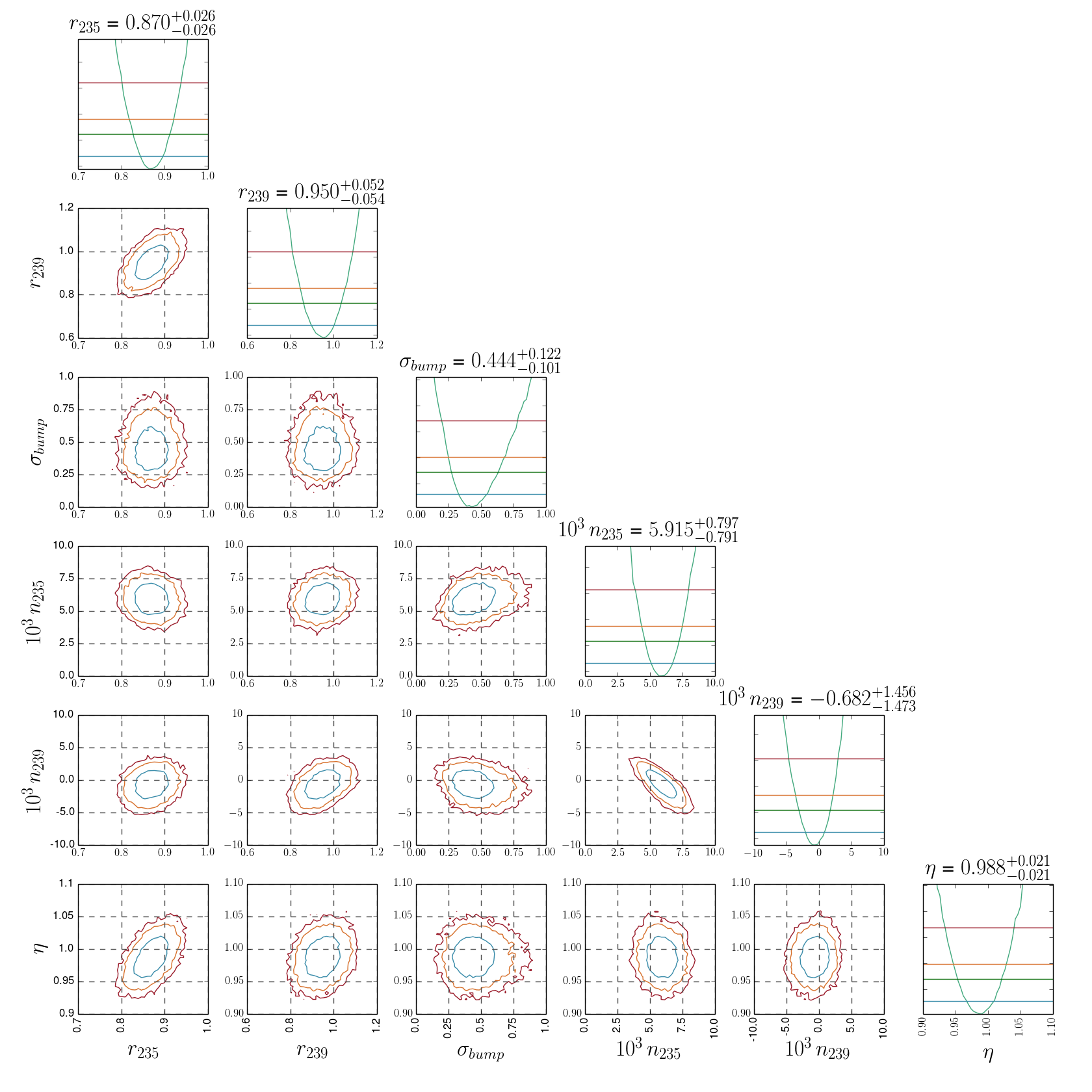
The results from a Markov Chain Monte Carlo analysis of spectral data to determine the preference for a Gaussian feature at 5 MeV in the reactor antineutrino spectrum. This analysis uses data from Daya Bay, PROSPECT and RENO. The overall goodness of fit is given by χ
2/d.o.f. = 91.8/68 (p = 0.029). See
arXiv:2005.01756 for more details.